Page Tops
The top of a page: an eyebrow, a lead and a row of buttons, and a hero with screenshots or a photo.
Eyebrow, Lead and Call-to-Action Row CMS
- Eyebrow: an optional short red line right above a heading. Use it on a page or card meant for one group ("For Students," as on path cards), or to flag something new ("New for Spring 2027"). Leave it off a page for everyone, such as an app's home page, and never repeat the site's name in it: that's already the big title at the top of every page.
- Lead: the larger first paragraph under a page title.
- Call-to-action row: lines up a button, a link and an optional note. A paragraph with just a button and then a call to action gets the same spacing without it.
- An app page's actions, such as New Semester on a list of semesters, go in a row under the heading and its lead, never beside the heading.
cmu-eyebrow, cmu-lead, cmu-cta-row,
cmu-cta-note
For Students
Borrow a Camera
Reserve one in about a minute, and pick it up at the desk.
Split Hero CMSScript
The top of a home page: copy on the left, art on the right. It becomes one column
below 820px. Lead with a tagline that says what the app does, then a button for the
main action and a "Get Started" call to action that jumps to the first section below,
headed Get Started. The tagline is the page's <h1>, and so is each
section's heading after it (see
Stacking Sections). The art can be:
- One screenshot, drawn in a browser frame.
-
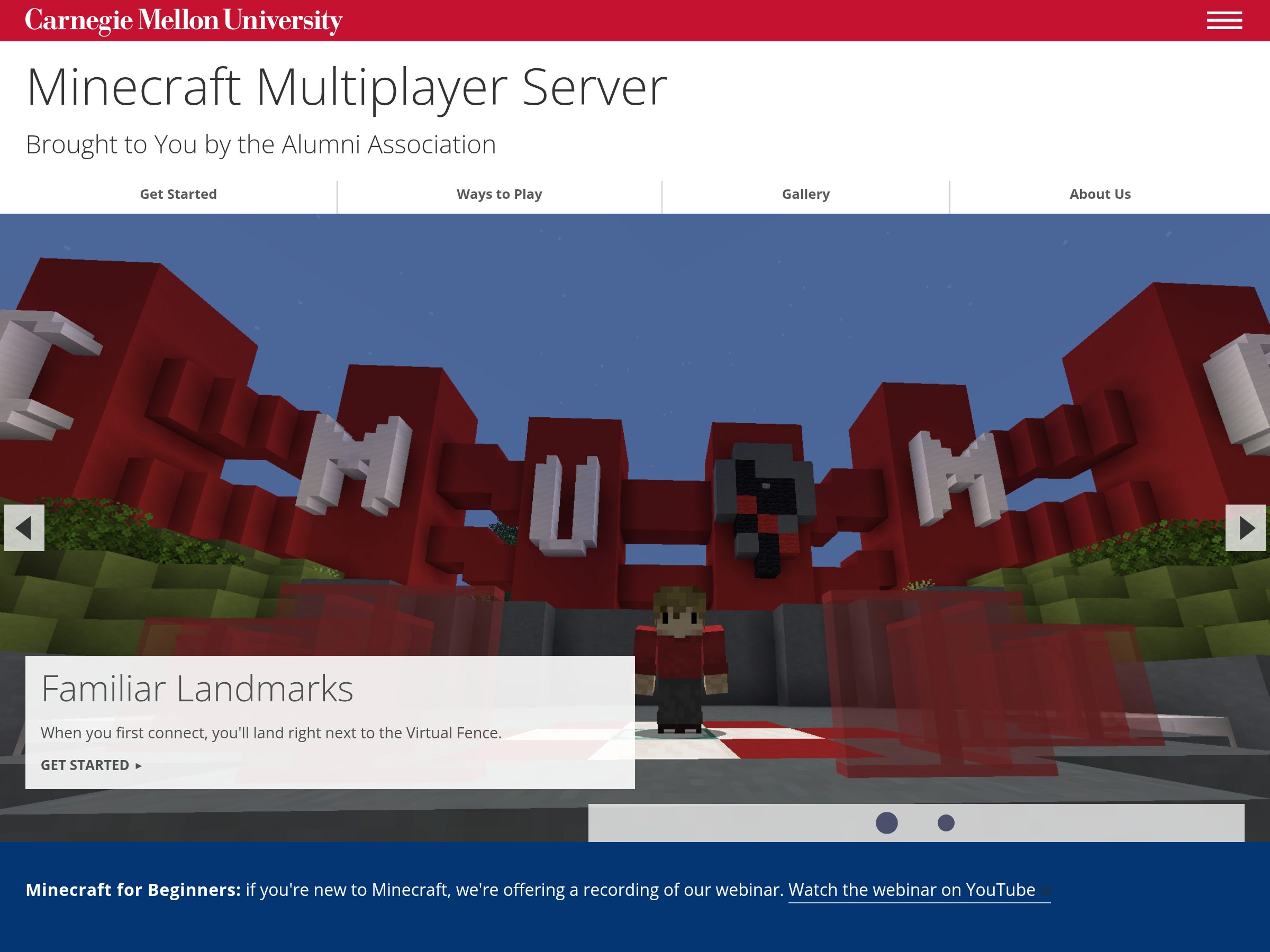
Two or three screenshots, overlapping, with
cmu-hero-art--stack. They're cropped to the same shape from the top, and the last one is in front, so put the main one last. To let people see one up close, link it to its full-size image withdata-cmu-zoom(see Enlarge on Click). -
A photo or a tartan with no frame, with
cmu-hero-art--plain. Use the tartan files from brand.cmu.edu as they come: the brand rules don't allow redrawing or recoloring the tartan.
cmu-hero, cmu-hero-art, cmu-hero-art--stack,
cmu-hero-art--plain
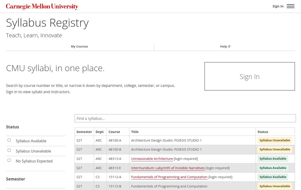
Two or three screenshots, each linked to enlarge on click:
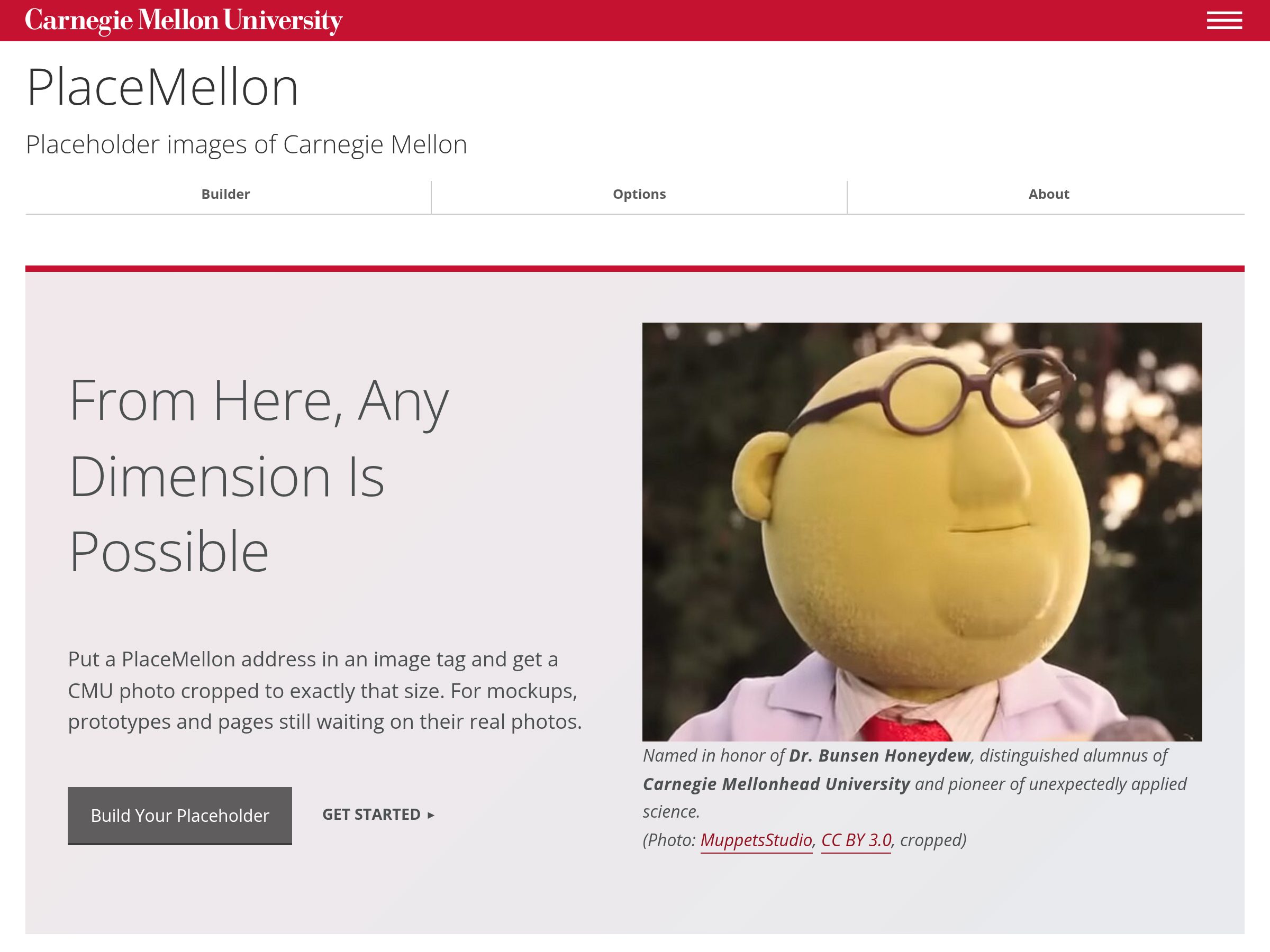
A photo or a tartan file:
<div class="cmu-hero-art cmu-hero-art--plain">
  <img src="images/tartan.png" alt="">
</div>
Full-Width Photo Hero Template
A full-width photo at the top of a page, before the breadcrumbs. It's a
div.hero with the photo as its background: a 900 × 600 version in
style for phones, and a 1400 × 700 version in
data-img, which the template's script swaps in on wider screens. Give it
role="img" and an aria-label describing the photo. In
Cascade, it's the page's Hero. On a page with a hero, the template drops the line
under the header's tabs, since the photo sits right below them.
Over the photo, either a line of text in a dark band (div.text, with an
<h1> and an optional <h2>), or a white box that
links somewhere (a.box, with left or right).
hero, text, box left, box right
Several heroes in a section.js-flickityCustom make a slideshow, with the
same carousel script. For a service description,
the kit's split hero with screenshots usually says more than a
photo.